One of the most rewarding parts about advertising is seeing the end result! Most business owners have visions and ideas of what they think their billboard will look like, and it is a very exciting process to start.
We are very fortunate to have a wide range of advertisers whether it be small local businesses or large nationwide corporations. While they may be different in size, one thing remains the same: Their message is important, and we want to make sure they have the most effective design possible!
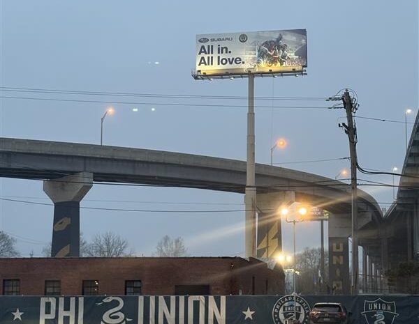
Outdoor advertising is in my opinion the best form of self-promotion there is, but I may be a little biased. While the goal is the same for all advertising, Outdoor does have its differences, and that is especially true when it comes to artwork.
The best way to describe what I mean is to imagine yourself as a potential customer you are trying to reach. You are driving down the highway at 70 MPH (more like 80 MPH in Jersey) and you drive past a billboard. The colors of the design catch your eye, but there is just too much to read and the message is lost on you! Your bummed out, but you just keep going.
As a vendor we would hate to see this sort of thing happen, which is why we always suggest the following rules:
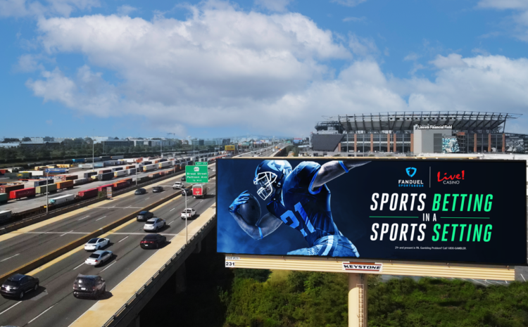
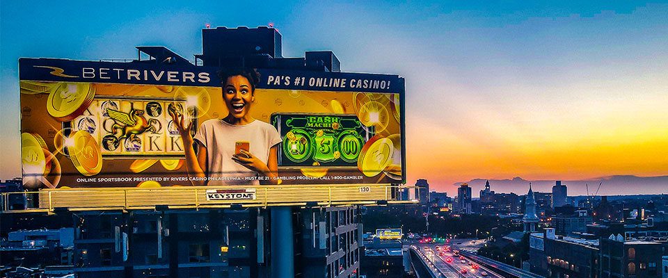
- 8 words or less – keep it simple and concise. Yes, this includes your name and tagline, website and address. (We will get to that in a little) What is the message you want to get across to your audience. Think about what is important and essential, and what isn’t truly necessary.
- Keep phone numbers, addresses and websites to a minimum, if you need it at all. Now a days, everyone “Googles” everything. When someone types in the name of your business all the important information shows up. Which makes it completely unnecessary to have a website, number or address listed on your design. It will leave you with a lot of room!
- With that room, we suggest making the remaining elements as LARGE as possible. Including your logo and especially any other text. Have you ever driven past a billboard with really small text and said to yourself “How on earth do they expect me to read this, without causing an accident?” Don’t let that be you!
- Here is a tip we like to tell our clients. Print out your artwork and hang it up on a wall. Try and stand at least 6 feet back and see if you can read what you have printed. Then blink your eyes! What stands out to you, what doesn’t? This is a great way visualize someone driving by your billboard. Especially 80 MPH in NJ.
- Finally, the most important rule I want to share with you is this: Be Open! As an advertiser what you want for your design, may not be the most practical. In no way, shape or form are we discounting your vision and ideas. At the end of the day, we want your campaign to be successful, and a very big part of that is the artwork. So, if we suggest something that maybe wasn’t what you were thinking, be open to all possibilities and know we have your best interests at heart.
In my job, something that I very much enjoy is when advertisers ask me for my opinion on artwork. If you ever find yourself communicating with me as you make your journey through Outdoor Advertising, please feel free to ask my opinion! I will always, respectfully give you my “two cents”.
Hope to hear from you soon!