Get inspired

Keep it Simple

The first step to creating effective messages with your electronic artwork is to keep the wording short and succinct. Avoid spelling out complete sentences. Don’t use eight words when four will do. Industry standard is eight (8) words or less. Stick with shorter, simple words to maximize quick comprehension by your audience. A single message idea will read quicker and more easily than trying to combine multiple offers. Avoid using landscapes or complex scenes (3 visual elements or less: 1 image, 1 logo and 1 headline).

Keep it Big

Large text will allow your audience to see your message from greater distance. If your text is too small, it will be hard to read. Your audience is then likely to disregard your message entirely. Although capable of much smaller, we recommend a 12″ character as a minimum. Three foot text, and larger, would be optimum.

Keep it Clean

Avoid using thin fonts as well as most script fonts. The strokes of each character are simply too thin to maintain legibility over longer distances. Use thick, heavy fonts to maximize readability. The bold option is an excellent way to add weight to your wording.

Keep it Clean
Keep it Colorful

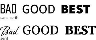
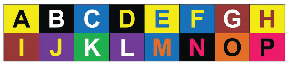
High color contrast is a key ingredient. Just like using large text, the right color combination can make your message readable from much longer distance.

For digital units, AVOID WHITE, PALE OR NEUTRAL COLOR BACKGROUNDS. As a rule, most bright/light colors work best on dark/black backgrounds.

Want to see your business on a billboard?

Use our mock-up tool and get a preview of your artwork on a Keystone billboard!

Need help with creative?

We’re happy to consult with you!

Phone Number
(856) 767-5028 x 107